4 evolving vibrant color trends that can aid your UI
Spanning across eras, color has always portrayed the emotions, feelings, and thoughts of people. Well-known artisans have worked with colors to illustrate their speculations, which have helped them gain admiration and respect worldwide. A lot of businesses have used the concept of color to publicize their products and themselves.
There is a lot of stuff that needs to be taken care about while creating user interface design. The techniques, patterns, and colors used on your user interfaces and websites can constitute an intrinsic effect on the users. The primary objective of user interface design is to facilitate people to relate and connect with your business. A simple, easy to use, efficient and responsive, UI design works definitely well. However, an immensely attractive UI design can make the experience of using that interface really gratifying.
Designers are very judicious about choosing the colors for the responsive web development and applications. Attractive color schemes used to develop responsive website design have an alluring effect on people who view it. Designers refine the usage of colors depending on the nature and characteristics of the business. Vibrant and bright colors usually opt for media and entertainment websites. However, the corporate businesses, the color schemes are now focusing on vibrant colors with an elegant and chic look with some modifications.
Vibrant Colors can be used in several ways and techniques in responsive web development. Designers are using impressive color schemes with existing elements allowing brands to retain their specific identities to develop a trendy and upbeat website. Using vibrant color is a big way to put in visual importance and user interaction ideas in responsive website design services. Color fastens the design saga and applicability, offering a project absolutely user-friendly.
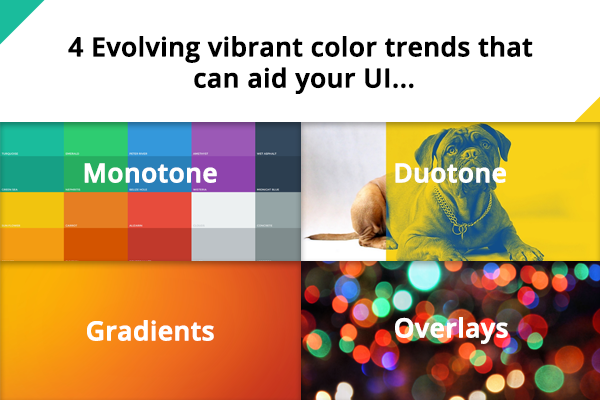
There are four color scheme trends that have become popular in the responsive web design services.
Monotone
A monotone scheme or a monochromatic color palette is made up of different tints or shades of a single color. This is the most popular technique to use vibrant colors in UI design. Monochromatic colors have a long-lasting effect on users and ignite visual interest. There are endless options available for Monochromatic color. Monochromatic colors ensure the readability of content through the solid color schemes for the UI design.
Monotone color schemes work splendidly with the representation of images from the same color clan. The imagery and descriptions tend to become the central spot of the design due to the contrast used.
Duotone
Duotone can be defined as a halftone replication of an image using the superimposition of one contrasting color halftone (traditionally black) over another color halftone. In this process, two color plates are made with the screen set at different angles. Duotone color schemes are generally used in the music/audio applications and for an assortment of promotional websites. Duotone color scheme acts as a color stabilizer that allows the text to occupy plenty of breathing space and color contrast. Colors are used in a more strategic way by brands to create an impact that is upbeat and at the same time candid and credible.
Gradients
Recently, gradients have become a popular option for UI designs. Following the vibrant color trend, high-contrast complementary colors are used to create gradients in responsive web design development. Modern gradients might include multiple colors, radiate from the center, come from a corner, or fall horizontally.
Gradients have made their way back into GUIs, this time using high-contrast complementary colors. Gradients used in UI designs include assorted colors, emanating either from the center or from a corner or drop horizontally. Gradients are used as background for web pages and they help in creating striking visual impact.
Overlays
When an image is passed through a colored layer, this is termed as overlays. Imagery with color overlays has become a trendy approach for the designers due to uncomplicated nature and considerably simple.
Overlaying responses can help users on various design aspects. While creating overlays, effort should be made to consider the type of color and the extent of saturation and pellucidity of the color. Vibrant color overlaid imagery or a background is a gallant way to have the finest of both business and pleasure.
Vibrant color has emerged as a great tool for helping vital or keywords position distinctively out from the backdrop.

Comments
Post a Comment