Logo Design Trends: The Top 7 That Help You Get Noticed In 2018
Unquestionably, the customer’s habits of consuming the content are evolving radically. The designers really have a hard time to step in with the changes occurring at the lightning-fast speed as the designs built today may become the tomorrow’s faux pas. It’s embarrassing, but the lone way to enable the business presence to stand out in the digital market is following the short-lived trends.
Similar is the event with logo design, which tells the crucial tidbits of information about the brand, the level of professionalism and the unique brand story. However, it doesn’t mean to change the brand’s logo as the trends changes, while it’s adding the creative twists and blending styles in the logo design to keep it fresh and soothing to the customers.
The logo designed in sync with the trends add appeal to the customers and inch them closer to the brand. One thing to remember, the trends changes, but not randomly and not every trend is a perfect bullet that you should implement in your website logo design. If you attempt, you are risking.
It’s all-imperative to get it right to mitigate the risks of rejection. We at Potenza Global Solutions, the logo design company have got your needs covered with a compiled list of 7 logo design trends that find a great level of acceptance in 2018.
Scroll through the list to see which trend help you to get build the best logo of all time:
1) Simple shapes still rocks
Presently, the creative logo designs are in demand, but the customers don’t like the design that is cumbersome with many graphic elements, hues, and color shades. Simplicity still works and that gives an edge to the logotype design trend.
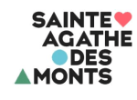
In the logotype design, the fonts are coupled with geometric shapes that give the logo a consistent look. The lines, rectangles, points, circles and other shapes are the cherries on the cake that improve the visual appeal of the logo and makes it special, this is why simple shape design trend is scoring high popularity.
2) The age-old: Negative space
The negative space logo design trend is around here for years and has evolved with time alongside accolades it earned. The design technique of creatively adding the image inside or between the letters is favored by the businesses as it illustrates at what the length the companies can go in offering the products and services and impress the customers. Give it a try, if the designer is able to showcase the company vision and mission in the company logo.

3) Play with text as a playground
Certainly, ‘the playground is yours,’ such innovation in the logo design can be seen. The design trend has given a wide space to the designers to experiment and shape their imagination with typography, font combinations, spacing and kerning. Yet, the full potential of the design trend is not realized and perhaps, more such graphic delights can be observed.
4) Gradients and color transition will hold their stake
The upbeat brands had taken the gradient smartly along with rainbow colors to add a new dimension to the flat logo. The designers pair the gradient effect with geometric shapes and overlap to make the styles appeal the audience. The versatility of the colors in the logo can be applied to both icons and texts, and which are easy to update as well.

5) Slices dominate in 2018
It has really got bigger in 2017 and the same is anticipated for 2018. The parallel lines give some space to the elements in the emblem to breath air and this spacing can be easily absorbed in the logo. The designing tactic is used by the designers to create the visual illusion, add 3D look and amazing effects to the business logo.
6) Letter stacking all set to blow away
Breaking the long phrases and stacking them on the top of each other has created ripples in the design sea in early 2017. The small breaks won’t change the visibility of the text, instead, adds a unique look with contrasting colors. Also, altering the font size and type in the stacking in conjunction with geometry shapes make the business logo design stand out unexpectedly and maintain the readability without any guesswork.
7) The great lettering
The hot business logo design trends are rethinking about minimalism, but lettering design still holds the ground. The complex inscriptions in the logotypes are less readable but prove to be effective in catching more eyeballs. That’s why varied businesses are trying their hands to exploit the full potential of the trend.

Comments
Post a Comment